Health care

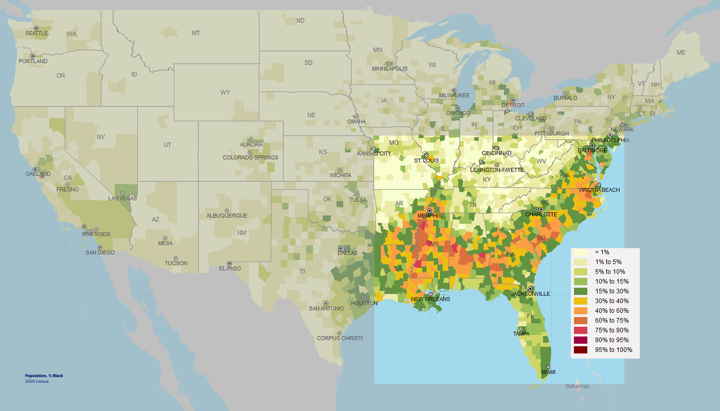
On this page, you can find various health care maps related to the Southern Crescent — maps on heart disease, diabetes, obesity and chlamydia, all of which have comparatively high rates in the Crescent.
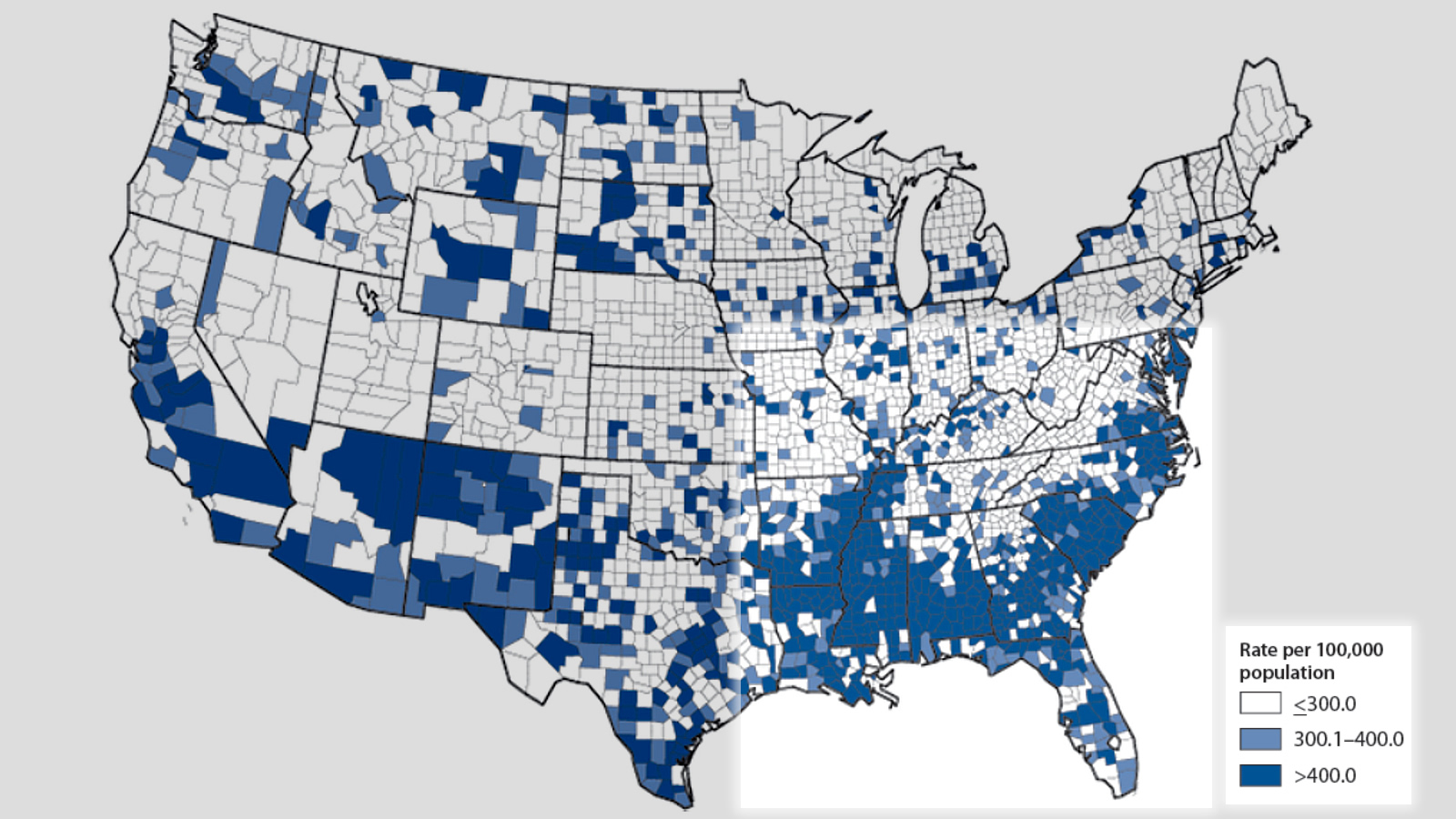
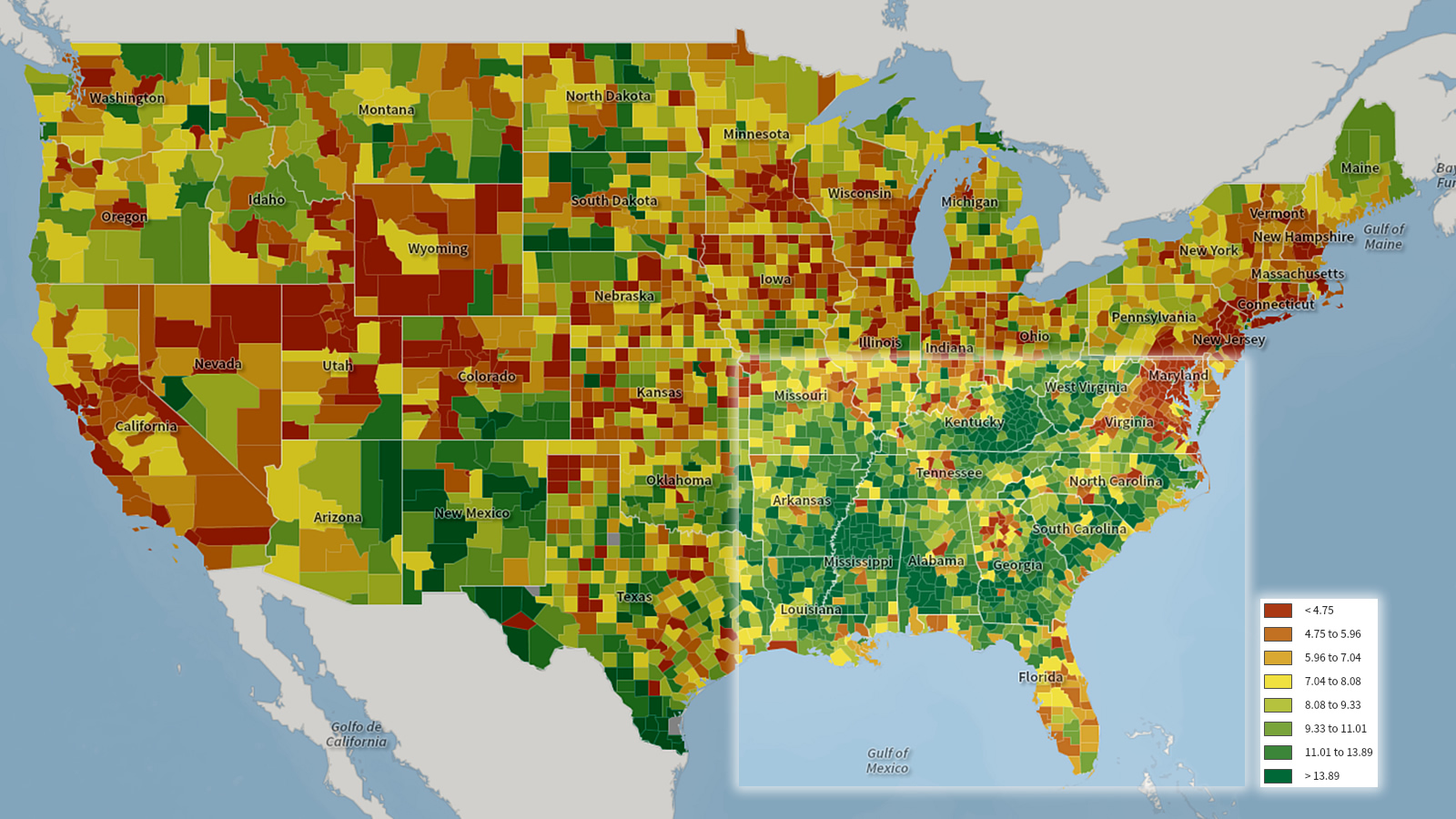
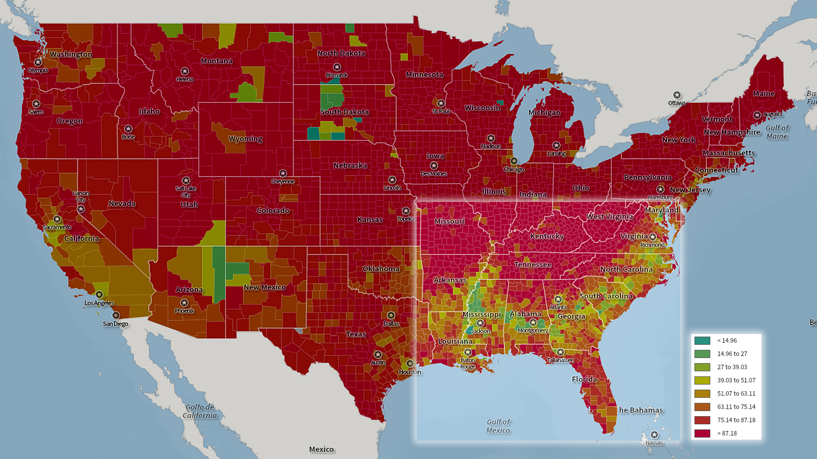
HEART DISEASE

The death rate from heart disease for people 35 and older is higher in the Crescent.  More info.
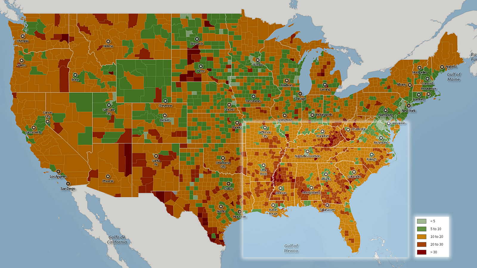
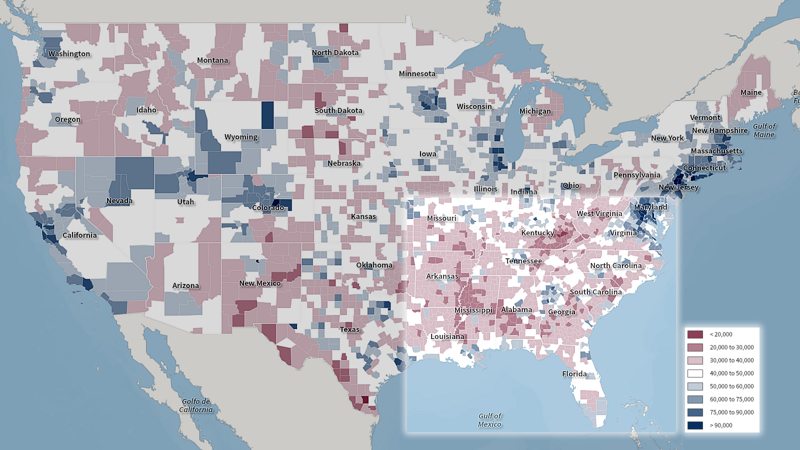
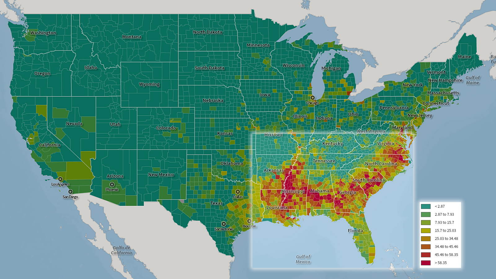
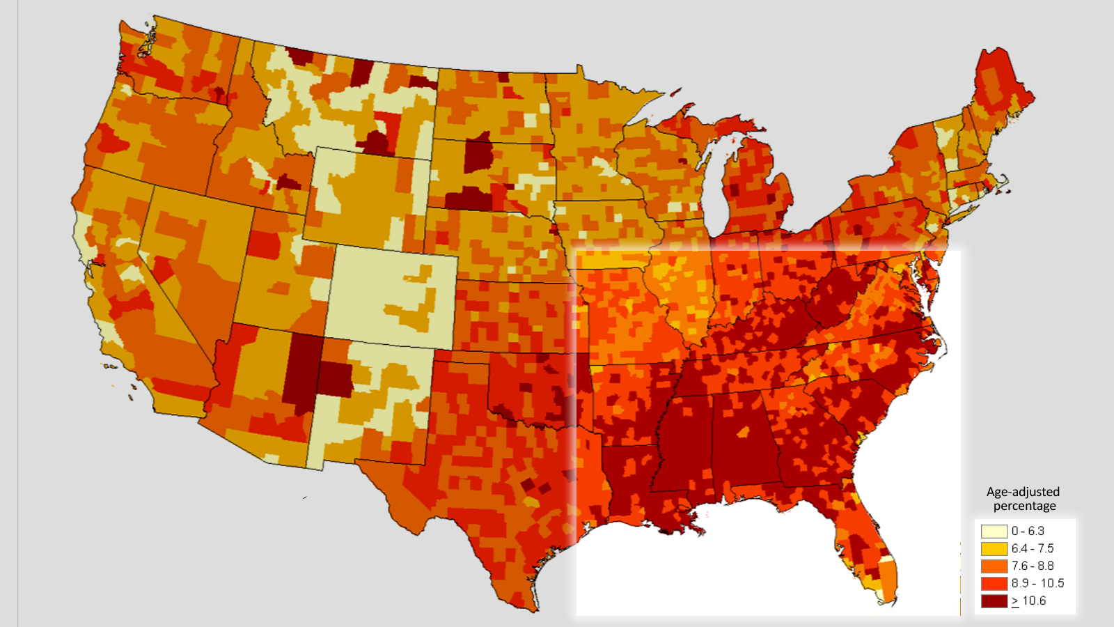
Death rate per 100,000 people, age 35+. all race. all gender. 2008-10, National Vital Statistics System, National Center for Health Statistics, Centers for Disease Controo.


DIABETES

People living in the Southern Crescent have a higher overall percentage of diabetes.  More info.
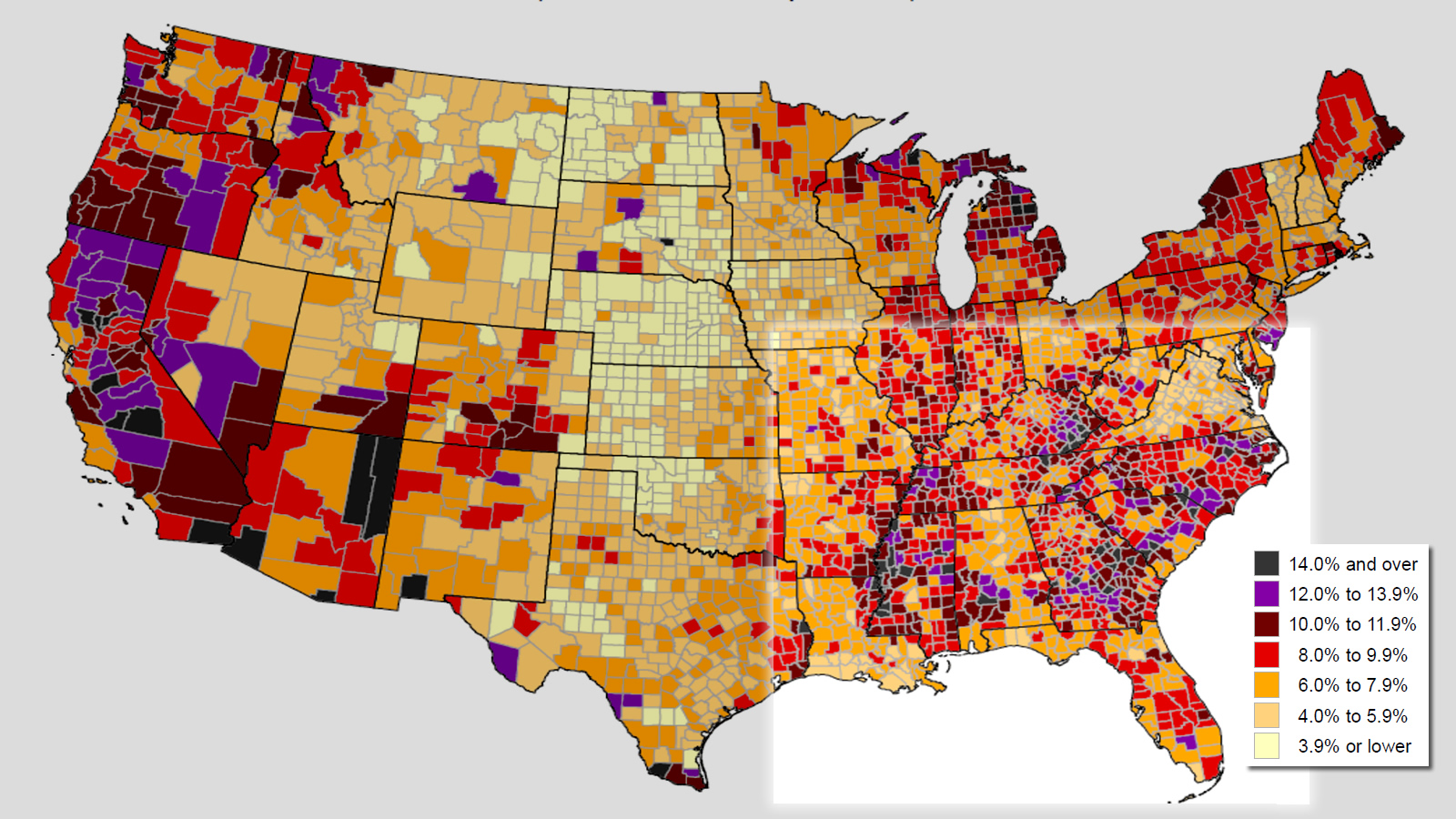
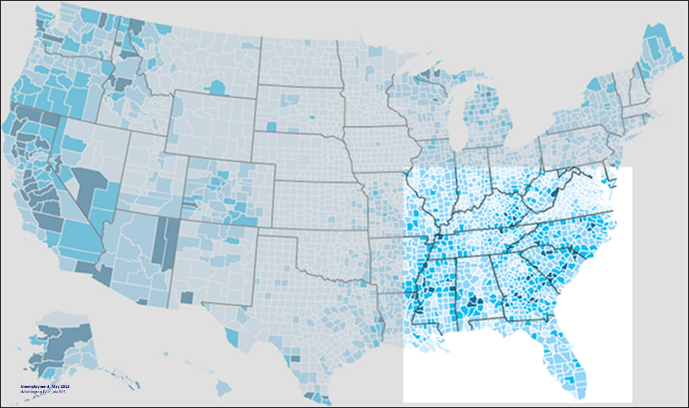
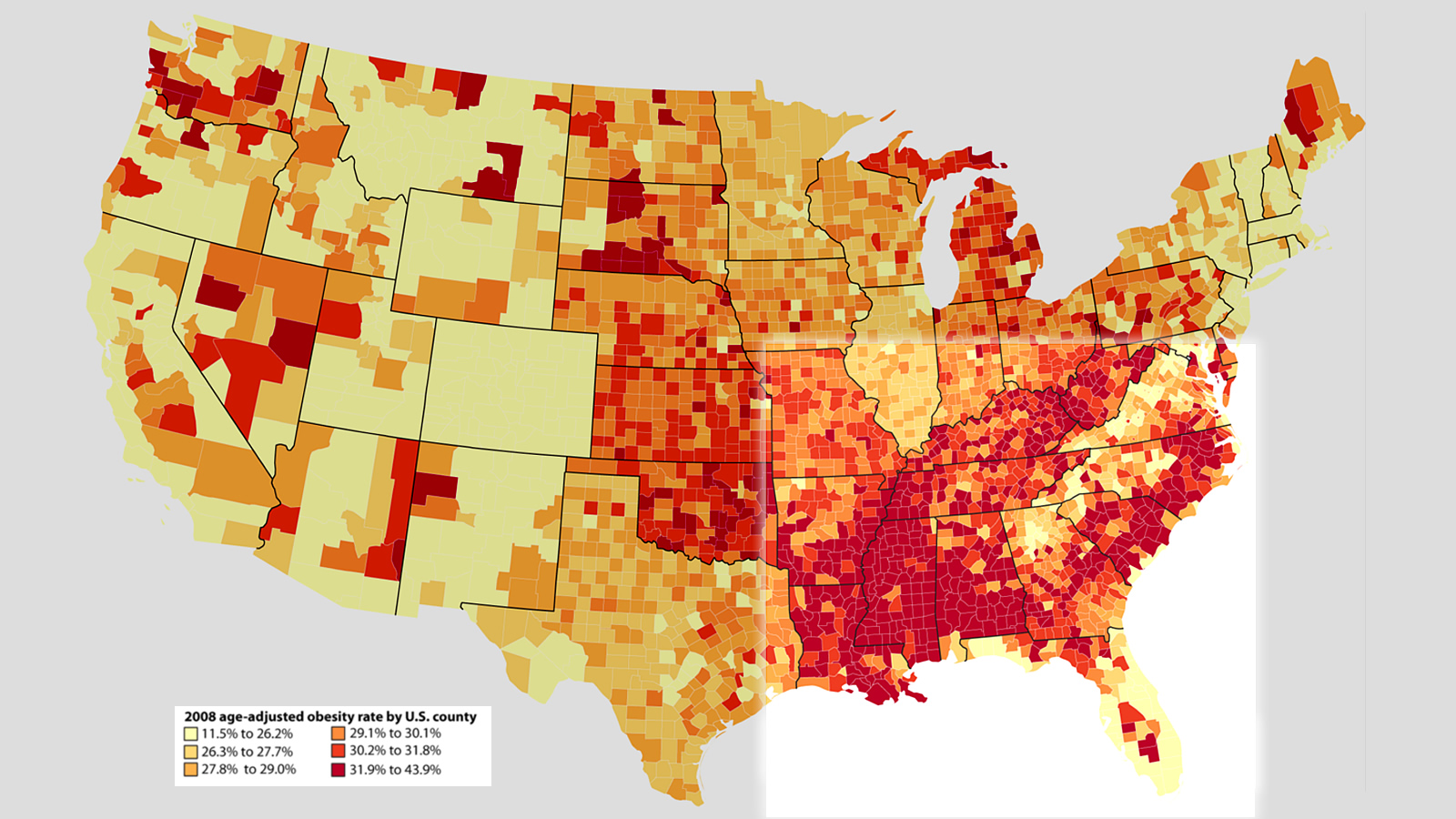
DIABETES_chart
Age-adjusted estimates of th percentage of adults whith diagnosed diabetes, 2010. Centers for Disease Control and Prevention: National Diabetes Surveillance System.


OBESITY

People in the Crescent are more obese than in other areas. (Map via Maxmasnick.com)
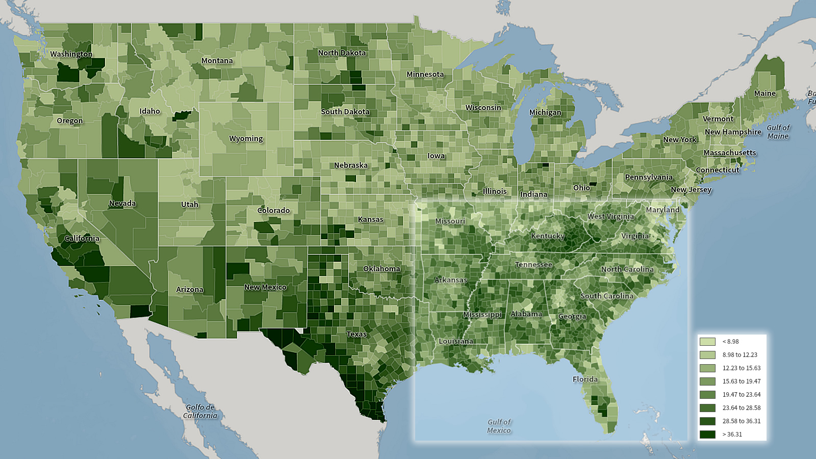
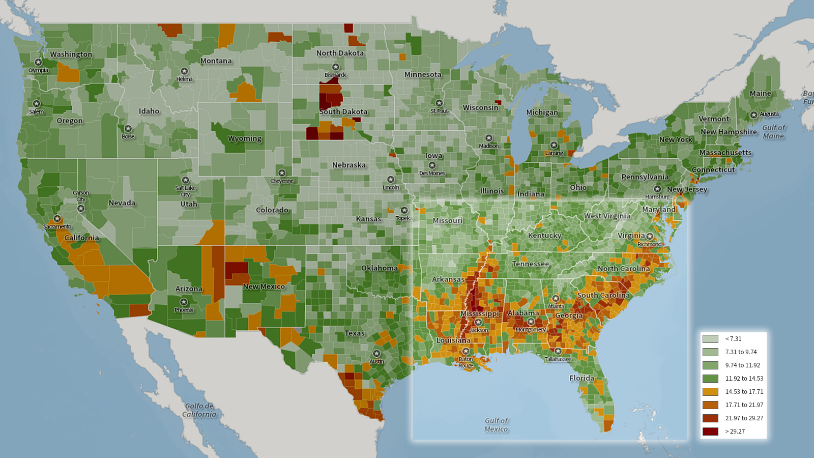
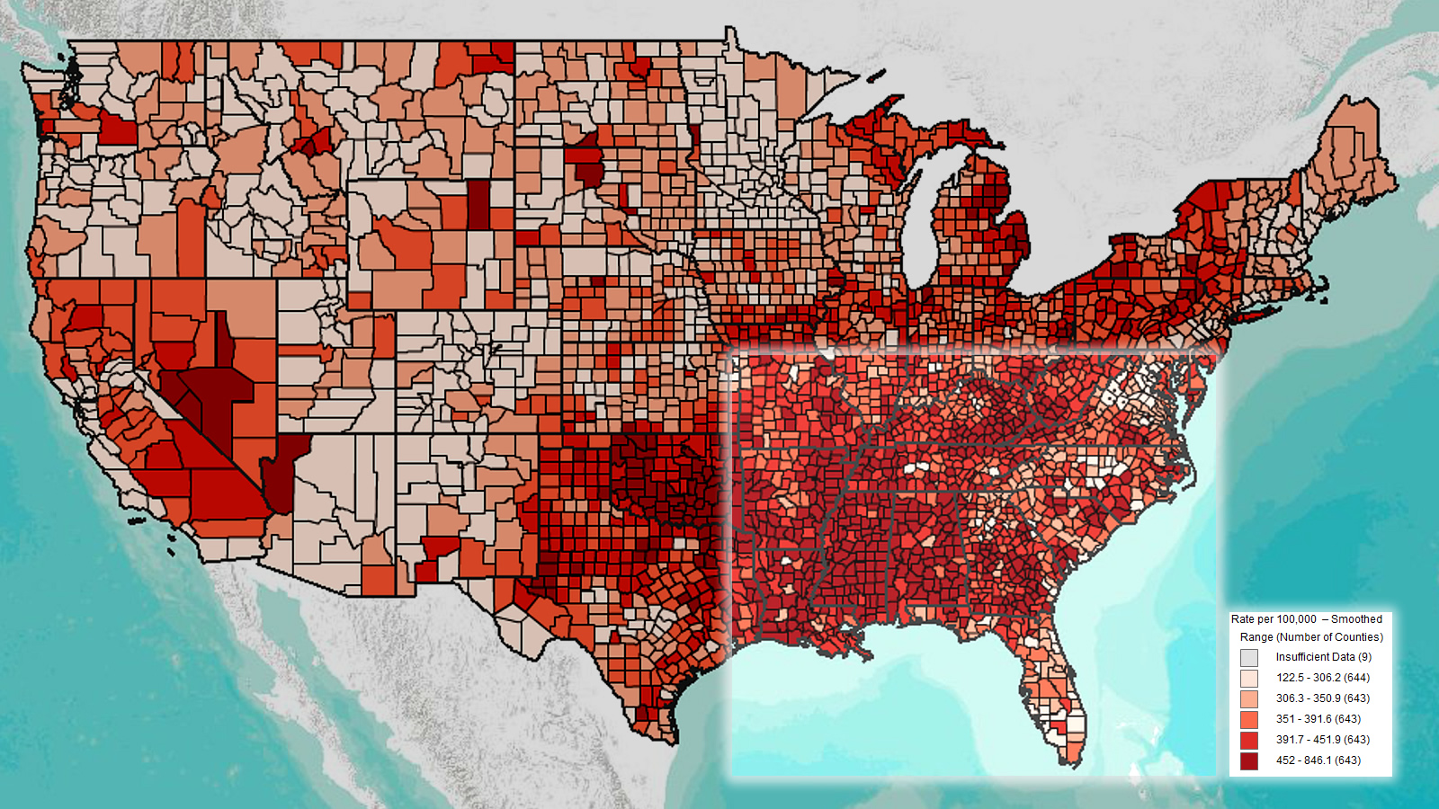
Age-adjusted estimates of the percentage of adults who are obese, 2008 data, Centers for Disease Control.


CHLAMYDIA

Crescent counties tend to have a higher rate of the sexually-transmitted disease Chlamydia.  More info. 

Chlamydia -- rates by County, U.S. Centers for Disease Control and Prevention, National Center for HIV./AIDS, Viral Hepatitis, STD and TB Prevention, Division of STD Prevention, 2010.
Chlamydia — rates by County, U.S. Centers for Disease Control and Prevention, National Center for HIV./AIDS, Viral Hepatitis, STD and TB Prevention, Division of STD Prevention, 2010.

Unemployment, 2013

Unemployment, 2013
Source:  Unemployment rates by county, August 2012 to July 2013, U.S. Bureau of Labor Statistics.

Unemployment rates by county, August 2012 to July 2013, U.S. Bureau of Labor Statistics.

The dark blue and purple counties had higher rates of unemployment in 2013.

Less than high school education, 2010

Less than a high school education, 2010
Source:  U.S. Census with image by Center for a Better South via Social Explorer.com

Counties colored with darker shades of green have an increasingly higher rate of people with less than a high school education.

EDUCATION10k_chart
Population 25 and over with less than a high school education, American Community Survey, 2006-10, U.S. Census.


Income less than $10,000 a year, 2010

Income less than $10,000 a year, 2010

Source:  U.S. Census with image by Center for a Better South via SocialExplorer.com

INCOME10k_chart
Household income less than $10,000, American Community Survey 2006-10, U.S. Census.

The green counties have a comparatively higher level of families making $10,000 or less in a year.


Median household income, 2010

Median household income, 2010

Source:  U.S. Census, image by Center for a Better South via SocialExplorer.com

Median household income, American Community Survey, 2010,5-year estimate, U.S. Censusl

Median household income, American Community Survey, 2010,5-year estimate, U.S. Censusl

The maroon and pink counties indicate a lower median household income.


Family, 2010

Female heads of household, 2010

Source:  U.S. Census with image by Center for a Better South using SocialExplorer.com

HOUSEHOLDsf_chart
Family households, female householders, no husband present, U.S. Census, 2010.


Percentage of households with single women as the heads of households in the South (highlighted in the box) with the red and orange counties representing higher percentages.


Population, 2010

Population, 2010
Source:  U.S. Census.  Image by Center for a Better South using SocialExplorer.com.

There are two maps for population based on 2010 Census data:  Percentage of white people and percentage of Black Americans.

Percentage of white population in the South with the darker red being higher percentages of whites.

Total population, white, U.S. Census, 2010.

Percentage of black population in the South with the orange and red  being higher percentages of blacks.

Total population, black or African American alone, U.S. Census, 2010.